


An exercise in user narrative, this project involved revisiting all of Fido’s travel products online.
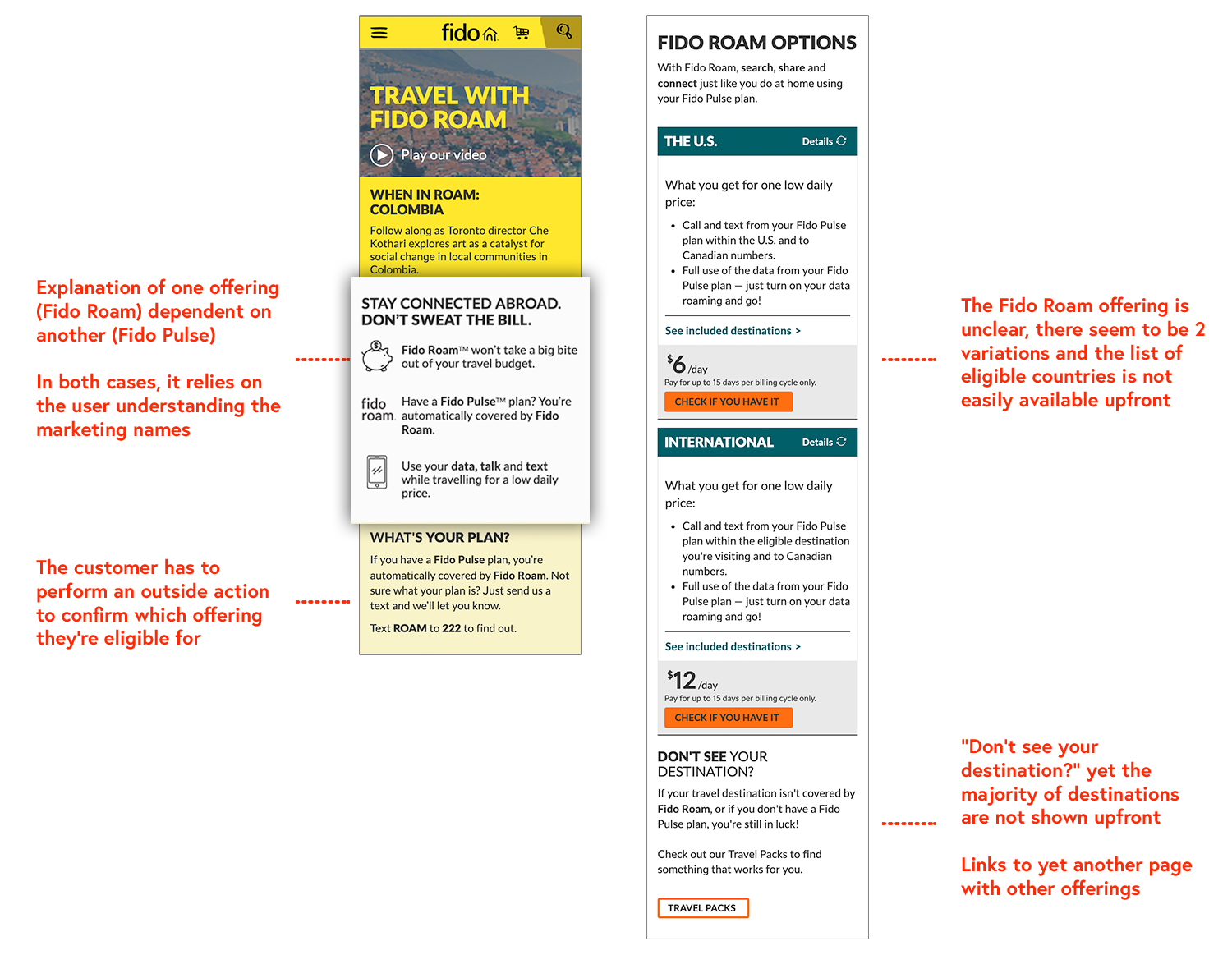
Fido offers many solutions for its customers traveling abroad. From daily rates for use of their current plan, to travel packages for either prepaid or postpaid customers, there’s many options to choose from. The inability to understand all these options generates a large volume of customer support inquiries (the 3rd most common topic outside billing & cancellation topics).
My Role
I was the lead designer for this project, starting with mapping the journey, testing the wireframe concepts and working on the UI.
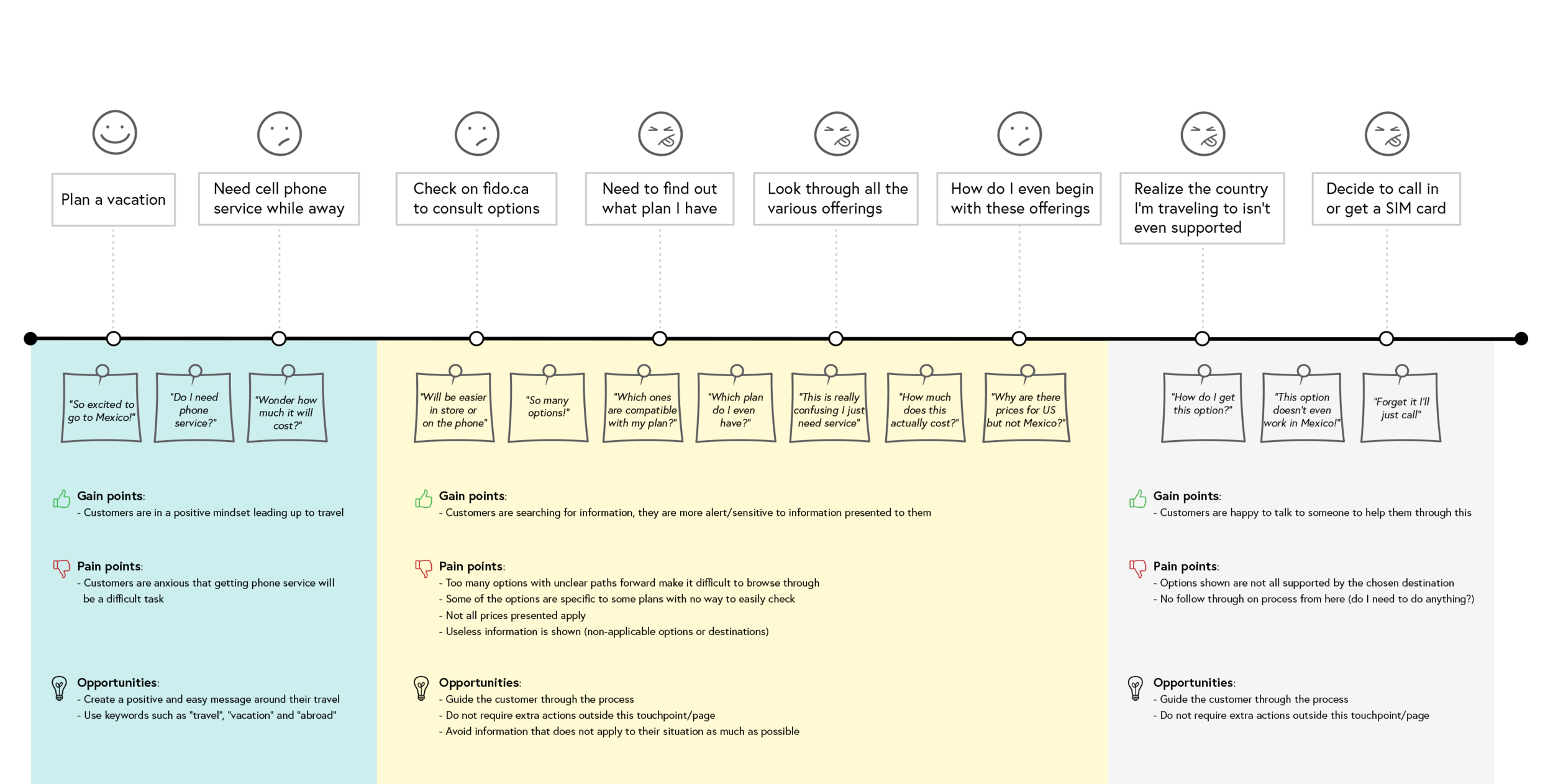
With the help of Customer Care as well as interviews done with customers, the user journey of the existing Fido Roam page was done in an attempt to see how it could be combined with the other travel product pages whilst reducing friction for customers.
User journeys were then translated into flows within the website. The biggest shift was aligning the journey online to the mental model the users were thinking through.
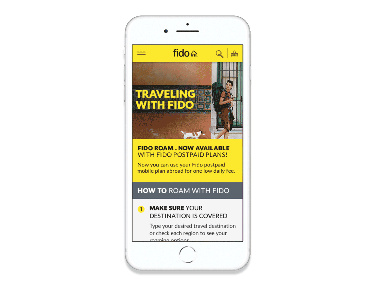
Instead of presenting our travel products in the clearest way possible, we shifted towards showing only the travel products the user was eligible to get and we combined that with a step-by-step guide on how to turn on roaming on your device.
- Reframe the entire experience as a “How to travel with Fido”
- First step is checking eligibility of the destination via a simple input interface.
- Show only the pricing options applicable to the country selected
- Follow up with how to activate the roaming feature