


As part of continuing efforts to improve customer success & sales, Fido decided to revamp its plans page in July 2018.
One of the largest call drivers to Care (frontline agents) was customers’ inability to discern the most recent plan rate card combined with the page’s lack of functionality for merchandising. Both of these factors led to discrepancy in a customer’s bill or an inability to understand what was and wasn’t included in each product.
Given the complexity of the business model, a revamp of the plans catalog was needed not only to help bridge the knowledge gap, but also give
My Role
I was the lead designer for this project, starting with mapping the journey, along with setting the requirements for the features within the page itself as well as iterating upon it post-implementation (with some help from analytics & Care).
We worked together with POs, dev teams, Brand, Marketing, and Care to build a machine that the business could feed their merchandising into while still being understandable for the customer.
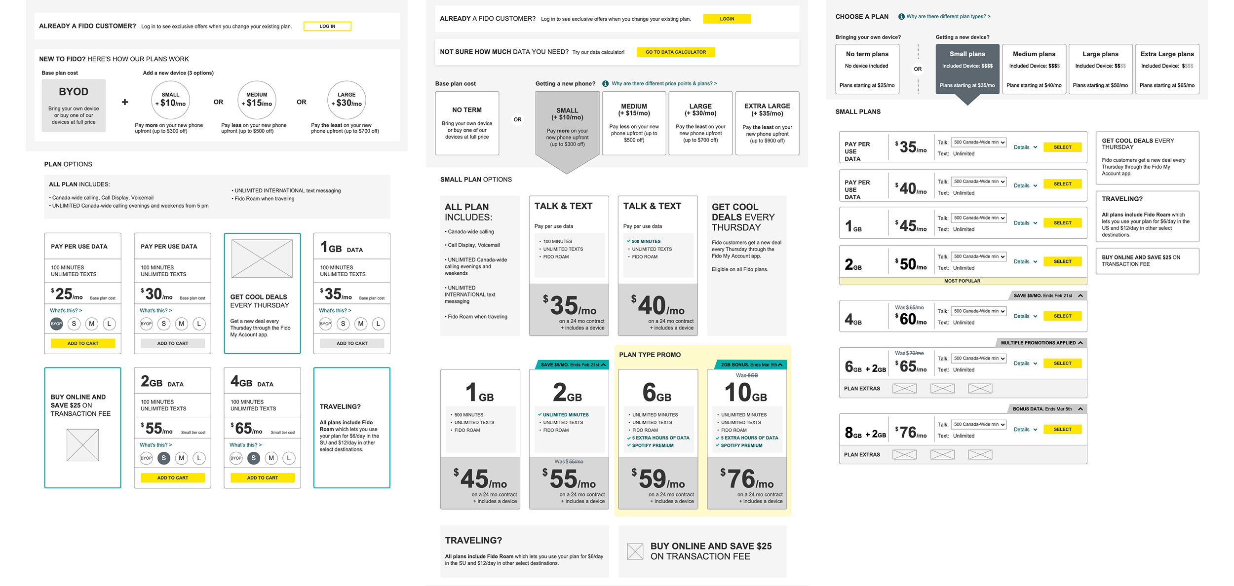
Looking at the previous design, we identified the current pain points from both a customer’s perspective (using data layers & analytics) as well as shortcomings from the business’ perspective. Key areas were identified as items to delve deeper into.
The POs, designers, marketing teams, Brand, Care and dev teams worked together to map the different aspects of the customer journey, the business needs as well as the relevant technology behind our product catalogs and fulfillment systems.
We then mapped out the journeys the plans page existed in as well as the decision tree a customer would take. Care was especially helpful in this aspect as they often take calls regarding sales.
Various concepts were developed & tested with user groups.
The final direction was chosen based on:
- whether the user was able to at least complete the flow
- whether the business model was understood
- were Fido’s market differentiators understood/perceived
- was the overall browsing experience pleasant and with minimal friction
- can users easily identify which plan best meets their needs/budget
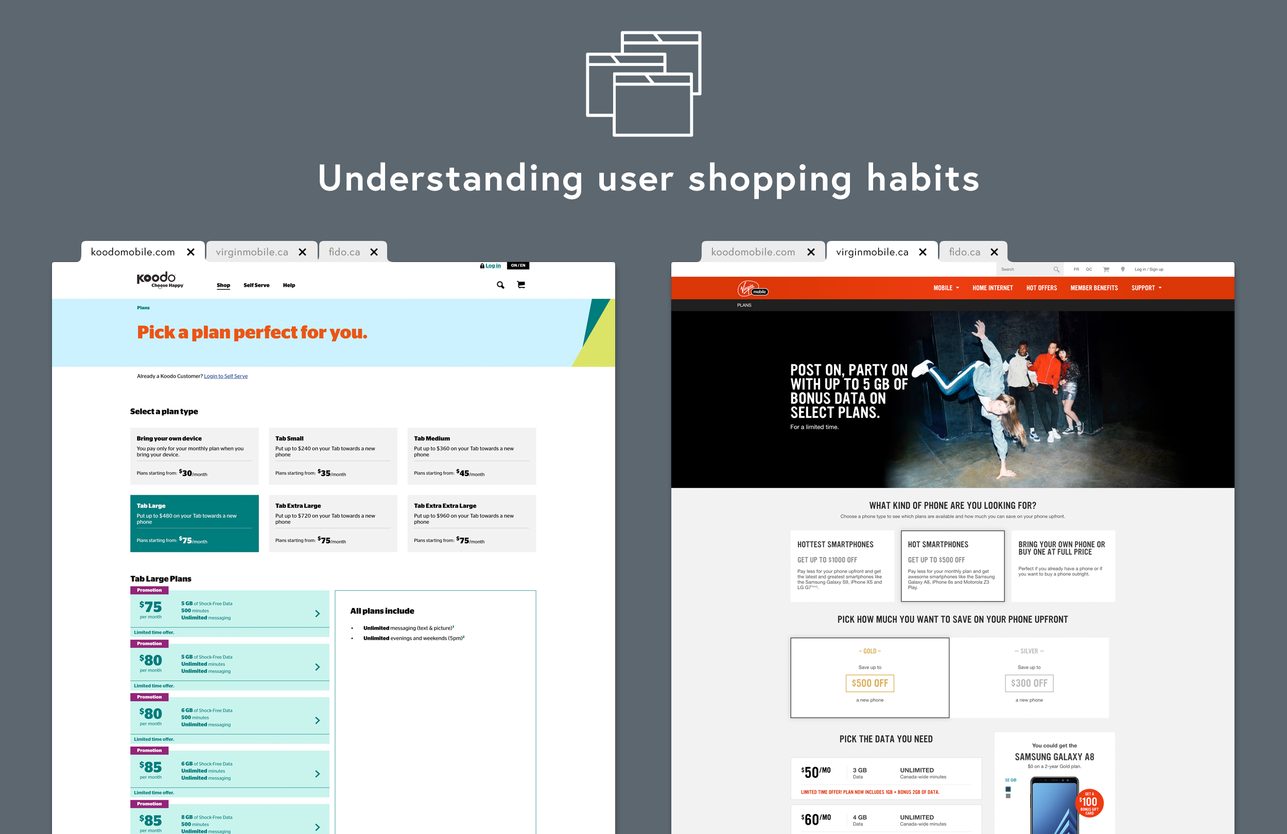
With the help of our partnership with Google, we were able to verify our hypothesis that most Canadians shop telecoms concurrently, which is often expressed by having a browser tab open with each telecom carrier.
What this means for the design is that we shouldn’t only limit ourselves; the Fido plans page does not exist in a usability vacuum, but alongside its competitors, and they contribute to a customer’s understanding of patterns.
Our goal was to make the shopping experience painless, so the Fido plans page design used similar patterns as its main competitors to make it easier for customers to cross-shop & compare apples to apples.
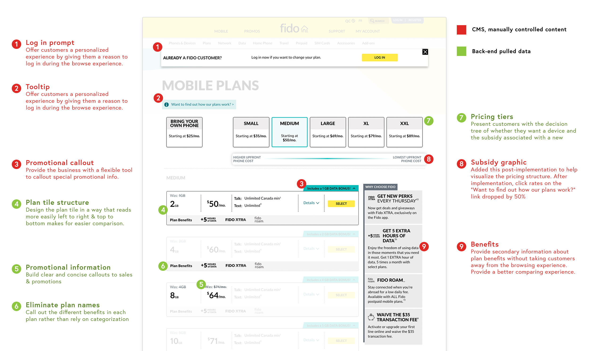
The Fido plans page was designed not only to be easier to use by customers, but easier to use by the business. Details & features were built to accommodate the shifting demands of the telecom industry.